
Color drenching has taken the design world by storm, and for good reason. This bold trend involves painting walls, ceilings, and trim in the same color family to create a cocoon-like, immersive experience. When done right, it's absolutely stunning. When done wrong? It can feel overwhelming, claustrophobic, or just plain off.
At Nahla Madison Home, we've seen countless homeowners fall in love with color drenching on social media, only to struggle with execution in their own spaces. The good news? Most color drenching mistakes can be fixed with thoughtful furniture choices that balance boldness with sophistication.
Let's dive into the seven most common color drenching mistakes we see: and how the right luxury furniture can save your space.
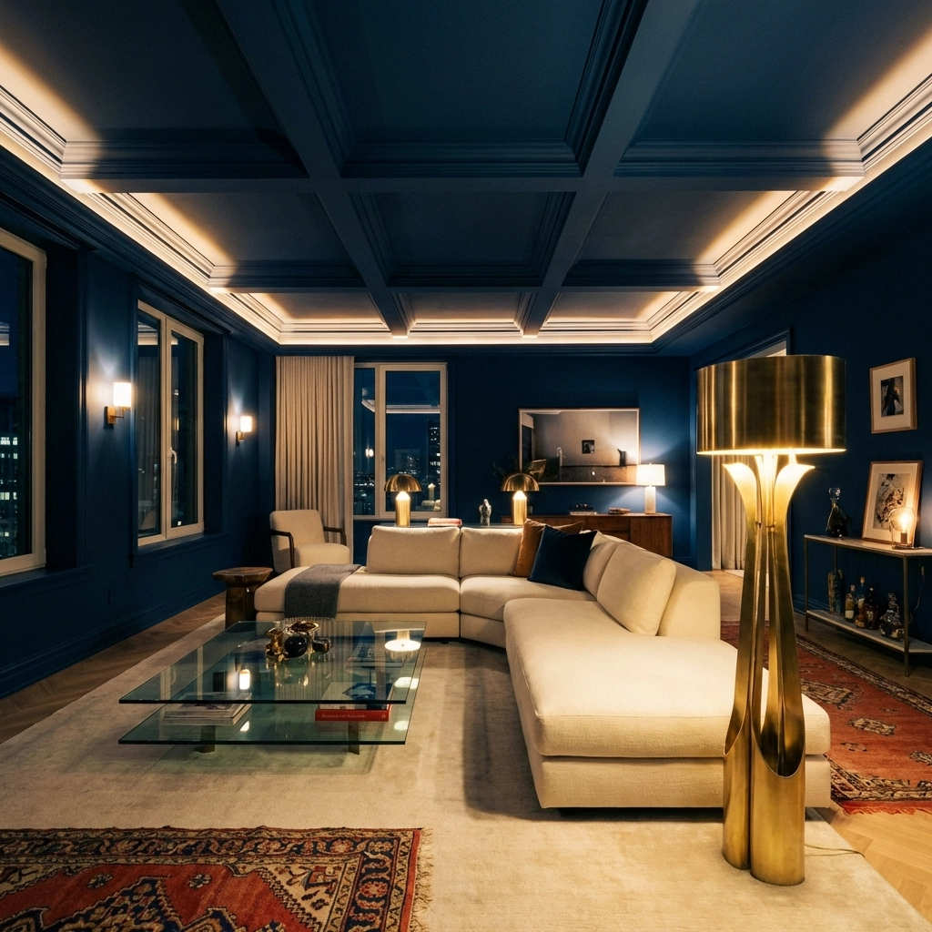
Mistake #1: Leaving the Ceiling White
This is the biggest miss we see with color drenching attempts. You paint your walls a gorgeous deep navy or forest green, then leave the ceiling stark white. The result? Your room looks unfinished, like you ran out of paint halfway through the project.
True color drenching requires commitment to the ceiling too. Paint it either the full wall color or a 50% lighter tint of the same shade.
The Furniture Fix: When you do drench your ceiling properly, the room can feel cave-like without the right furniture height and scale. Choose low-profile sectionals that don't compete with the dramatic ceiling. A sleek, modern coffee table with clean lines helps maintain visual breathing room, while tall floor lamps draw the eye upward and make the space feel more proportional.
Mistake #2: Choosing the Wrong Room
Not every room is meant for color drenching. Small bathrooms without windows, narrow hallways, and rooms with poor natural light become oppressive rather than cozy when drenched in bold color.
The sweet spots for color drenching? Dining rooms, powder rooms, bedrooms with good light, and home offices. These spaces benefit from the intimate, cocoon-like feeling that color drenching creates.
The Furniture Fix: If you've already drenched a challenging space, strategic furniture placement can help. In a narrow hallway, a slim console table with a large mirror creates the illusion of width and reflects light. For poorly lit rooms, choose furniture with reflective surfaces: think lacquered finishes, glass accents, or metallic details that bounce available light around the space.
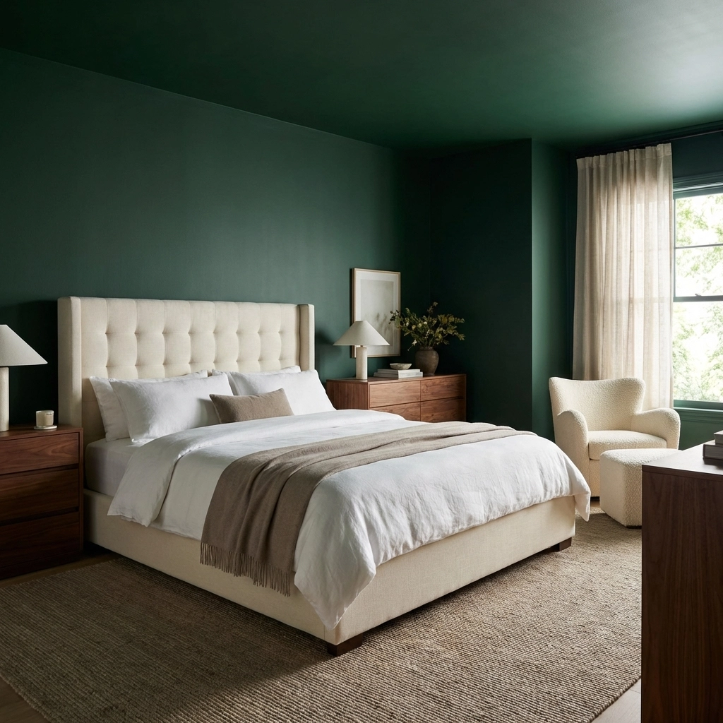
Mistake #3: Selecting Colors Based on Photos Rather Than Real-Life Use
Instagram-worthy deep forest greens and dramatic blacks look stunning in photos but can feel oppressive in daily life. That bright coral that photographs beautifully? It might keep you awake at night if it's in your bedroom.
Colors behave differently throughout the day and under various lighting conditions. What looks cozy at 2 PM might feel overwhelming at 8 PM under artificial light.
The Furniture Fix: If you're stuck with a color that's more intense than you expected, your furniture choices become crucial. Neutral-toned upholstery in creams, taupes, and soft grays helps calm the space without fighting the wall color. Rich wood tones in bedroom furniture add warmth and grounding to cool-toned rooms, while white and natural linen textiles provide visual relief in warm-toned spaces.
Mistake #4: Ignoring Undertones
This is where many DIY color drenchers go wrong. You think you're using the same color throughout, but undertones create subtle shifts that make the room feel disjointed. A blue with gray undertones on the walls paired with a blue with green undertones on the trim creates an unsettling effect.
The Furniture Fix: When undertones are slightly off, furniture becomes your mediator. If your blues don't quite match, introduce chairs that bridge the gap: perhaps a navy with both gray and green undertones, or add accessories in complementary colors that tie everything together. Metallic accents in furniture hardware or lighting can also unify mismatched undertones.
Mistake #5: Using Overly Saturated Colors on Ceilings and Trim
A deep navy might look stunning on walls, but that same intensity on the ceiling can make your room feel like a cave. The key is understanding that different surfaces need different intensities of the same color.
The Furniture Fix: When your ceiling color is too intense, low-profile furniture becomes essential. Choose beds with lower headboards, streamlined benches instead of bulky seating, and horizontal rather than vertical storage solutions. This keeps the visual weight low and prevents the room from feeling closed in.
Light-colored upholstery and textiles also help balance an overly saturated ceiling by reflecting light upward and creating contrast against the bold color above.
Mistake #6: Poor Flow Between Adjacent Spaces
Color drenching one room in deep emerald while the neighboring space is bright white creates a jarring transition. Your home should feel cohesive, even when you're making bold color statements.
The Furniture Fix: Furniture placement and selection can create smooth transitions between dramatically different spaces. Position a console table or coffee table near the threshold that incorporates both the drenched color and the adjacent room's palette.
Use area rugs to bridge color gaps: a rug that pulls colors from both rooms creates visual continuity even when wall colors are dramatically different.
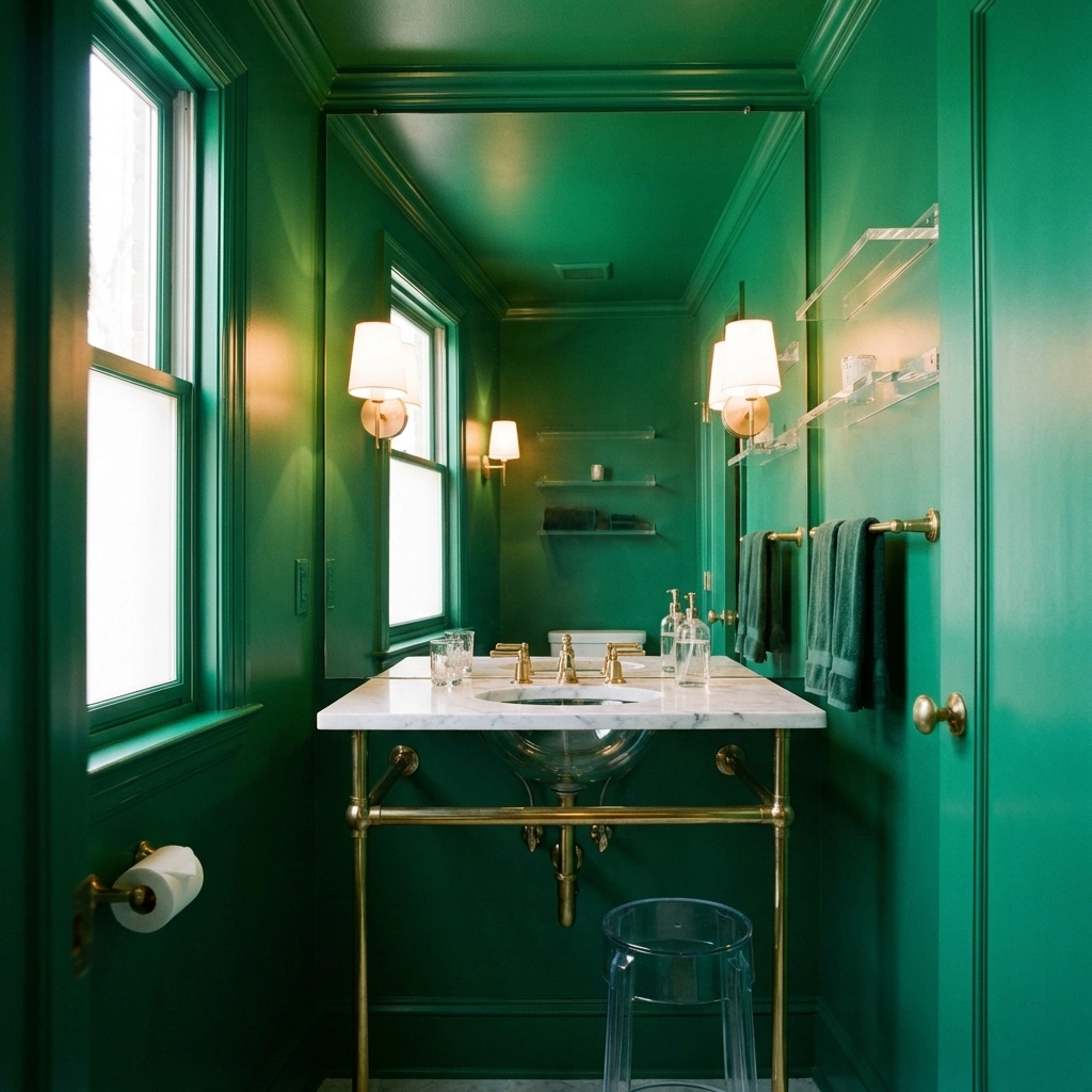
Mistake #7: Overwhelming Small Spaces
Color drenching a tiny powder room requires a completely different approach than drenching a spacious dining room. What works in a grand space can feel suffocating in a small one.
The Furniture Fix: In small color-drenched spaces, every furniture piece needs to earn its place. Choose multi-functional pieces like nightstands with built-in storage or nesting tables that can be tucked away when not needed.
Furniture with legs rather than solid bases helps maintain visual flow along the floor, making the space feel less cramped. Glass and acrylic pieces practically disappear, letting the bold wall color take center stage without adding visual weight.
The Nahla Madison Home Approach to Color Drenching
At Nahla Madison Home, we believe color drenching should enhance your space, not overwhelm it. The key is balance: bold walls need thoughtful furniture to create harmony rather than chaos.
When working with color-drenched rooms, we focus on:
- Scale and proportion: Furniture size relative to the room's new visual boundaries
- Texture variation: Mixing smooth, rough, soft, and hard textures to add interest without color competition
- Light reflection: Strategic placement of mirrors, metallic accents, and light-colored upholstery
- Breathing room: Ensuring furniture doesn't compete with walls for attention
Making Color Drenching Work for You
Color drenching isn't going anywhere: it's a timeless technique that creates instant drama and sophistication. The difference between a color-drenched room that feels like a high-end hotel suite and one that feels like a mistake often comes down to furniture selection and placement.
Remember, your walls are just the backdrop. It's the furniture that makes a space livable, comfortable, and truly luxurious. When you balance bold color choices with thoughtful furniture selection, you create spaces that are both Instagram-worthy and genuinely enjoyable to live in.
Ready to master color drenching in your own home? Start with one statement room and carefully chosen furniture pieces that complement rather than compete with your bold walls. The result will be a space that feels intentional, sophisticated, and uniquely yours.
Visit Nahla Madison Home to explore furniture pieces that can help you achieve the perfect color-drenched look in your space.

